Over the past few years UX design stopped being a standalone process. We started to iterate with developers and research assumptions. We started pitching and selling concepts to Clients. Today, there are thousands of scattered users that are stakeholders of our products. And it’s mostly our job to make them happy.
But the industry hasn’t followed the trend. They still publish thousands of useless pages of API calls that do not make any sense even to the most knowledgeable developers. They make sure they put a link to their FAQ on every page but fail to put any thought into it. They A/B test their Contact Us pages to make sure that we can drop them an email in a fancy form but do not take into account the remarks we share when designing their websites.
UX designers? Who cares!
UX is still treated as a bastard child of programming. We are served flashy animations and videos but even the industry leaders fail to understand the that knowledge is necessary in decision making. That’s a serious problem. Our requirements are iterative and prone to change. And it’s mostly our job to make sure that the development team is on the same page when said change happens. Nothing feels worse than seeing your entire team look stupid in front of a Client, because someone couldn’t write a decent 3-page long .doc file or draw a simple mockup.
The fault in our PayPals
PayPal has always lacked a proper approach to the UX designer’s role. It is a robust, complicated service that does a poor job of explaining itself. There are hundreds of pages of manuals that would take you weeks to read them all. Plus, you have to actually install the service in order to get the look and feel.
I still need to have a developer on the phone every time I want to draw a mockup just so I don’t screw up. I can’t easily explain how PayPal works to my client. And when I finally try to explain it, I have to rely on my very limited knowledge and have someone from my team step in every time I make a mistake.
The industry relies on PayPal. Pointless payment screens? Gone! A/B testing of form fields? Poof! Copywriting for credit card details? No need for that too. Just place a small, blue logo and your app is good to go.

Paypal is a really big improvement compared to what was used before but it’s still far from perfect!
That’s why I was so frigging pumped for Braintree. Braintree is a service made by Paypal, which essentially is a simplified version of its older brother. It is designed for smaller businesses and it’s lean and not as robust as its parent company. But it is still impossible for a non-technical person to understand how Braintree works. A great example of that is:

Srsly?
I like nitty gritty. I like to get my hands dirty. As a UX designer I don’t need a developer to understand everything. If I need any help, I’ll shoot you an email or ask you on Twitter. But allow me to explore what you can do so I can see whether and how you can fit my clients’ needs.
The problem with services
PayPal may call itself a provider but, in fact, it’s a service. The purpose of a service is to provide an (in)tangible product that you can exchange for (in)tangible payment.
A commercial transaction is a great way to illustrate how a service operates. You are sold a product in exchange for payment. Both the shopkeeper and you get something out of the trade.
The questions is: do you need to hire an interpreter to help you buy a pie? Someone who understands the intrinsic, hidden details of buying apples? A master at weighing bananas? No.
It is why I don’t get it why I need an interpreter (i.e. a developer) to understand how PayPal operates. My job as a UX Designer is to basically make a shopping list. I research whether what we have is what we need and whether my Clients and Users will like it. Then the developer actually delivers groceries. We will fail if either person screws up their job or does the job they/them are not qualified for.
Sometimes I need someone to help me choose the right product. A wingman. A compass. A guide. And it’s best when I can get that person fast, instead of spending hours waiting for an answer. That’s where the manual comes in – I need it to get some basic understanding of the product. I don’t want to bother a Customer Service person every time I try to use something.
So how do you fix it?
Google Analytics had a really bad approach to explaining their service a couple years back. Their service was impossible configure, so there was an actual job that involved setting up GA properly. They also had no idea how to tell you which tools you would want to use. They tried to write stuff and they were quite miserable at it.
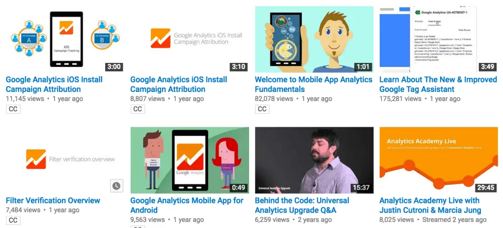
But it changed. They started producing tons of content (videos and text) that explains how the service operates in a way that’s understandable even to people who haven’t had any previous experience with internet analytics. They also redesigned their website. It may not be pretty but it does its job of explaining the service well.

It still takes a lot of time to actually start using GA effectively. You will have to spend hours reading and researching things you want to test. But a series of tutorials will guide you along the way. Nice people in videos and articles direct you to related content, so that you don’t get lost. And if you do, you can easily find where you left off or explore some new content.
You are also able to decide which parts of GA you will want to use by reading brief descriptions. You aren’t reading Proust’s In Search of Lost Time but bite-sized, crafted pieces, valuable to you and your business.

You will still need to get a developer to set up GA properly. But at least you will be able to tell them what you want to accomplish and what you need to measure. You can learn along the way how to expand your research by adding new functions. And, sooner or later, you will be measuring everything you want.
And that’s what a good manual does. It invites you to learn and guides you throughout the process.
How do I fix my own product’s manual?
Well, it’s going to be a process. Just write a few paragraphs, record something and create a webinar. Create a booklet or send out postcards. The possibilities are endless, there’s absolutely nothing holding you back.
To create a truly amazing experience you need open up to your users. Here’s a few simple tips to get you going:
- Sit down with your Customer Service and figure out what your users need. Compile a list. Ask potential customers what they would like to know. Do some research on what your competition do and think about why they do that.
- Create the first draft of your manual, send it out to your users. Ask them whether it is helpful and what else they would like to read. Iterate. Publish it on your site, ask for feedback. Iterate. Refine it every time something crops up.
- Add some sort of a live chat service. Compile questions, create new lists of questions. Answer them.
- Do some UX Research on how well you have explained your service. Ask people from outside your industry whether they understand it. Now ask people from your industry. Iterate.
- And finally, don’t stop. Ever. There is no such thing as a final version when it comes to delivering a great user experience. Your product is growing and so are people’s expectations.
- Be happy. You have successfully established Customer Support that works for your users.
If you still have questions on writing manuals or just want to talk UX stuff, give me a shout. I always enjoy a good conversation.


