The important role of UX and UI design in FinTech and banking apps
05.07.2021 | 10 min read
The pace of digitalization in financial services have been accelerating for a number of years now. We’ve recently seen the emergence of FinTech as a Service platforms (FaaS), a rise in digital-only banks, wider use of biometric security systems and the rise of autonomous finance. Of course, its FinTech that’s leading the way when it comes to digital transformation. But its through Fintech's UX design that these applications can really serve their purpose, as user demand for convenience is growing.
While there are significant changes being made to make banks more user-friendly and to offer consumers efficient, remote access, there are still certain areas in which FinTech is dominant, and one of them is UX and UI. But why are these such key elements of the overall customer experience? And why is it drawing in more users than ever before? Today we’ll take a deep dive into the subject to find out.
Why Fintech UX design is important
Ultimately, the significance of fintech UX design lies in its ability to transform the often overwhelming and intimidating realm of financial technology into a user-friendly and accessible domain, making it a vital ingredient for success in the rapidly expanding world of financial services.
In the ever-evolving landscape of financial technology, UX design plays a pivotal role in shaping the success of fintech products. An experienced UX designer, armed with a deep understanding of both fintech design principles and user behavior, holds the power to create seamless and engaging experiences for users.
The thoughtful integration of UI design elements ensures that users can effortlessly navigate through the intricate functionalities of fintech platforms, making their financial interactions both efficient and enjoyable.
1. Build an engaging product identity
Traditionally, banking apps have been known for subdued colours and technical jargon. FinTech has turned this around on its head, providing a totally different, exciting brand experience far removed from the functional banking product. And product identity counts for a lot in the modern market, where competition for new users can be tough. Studies have shown that strong brand identity not only compels consumers to try a new product, it will also have an impact on them staying with a business for longer (Consumer Research Insights on Brands and Branding: A JCR Curation, 2020).
Concerned that your product identity isn’t strong enough? Think back to your values and vision. Your values are strongly linked to your brand personality, which is what helps you to establish emotional connections with your future users. For example, PayPal’s values are innovation and collaboration. They put their customers at the heart of everything that they do. So start with the values and then speak to an experienced design team about how you might bring these to life for your customers.
2. Create a clear user flow
Finance, by its very nature can be complex to the average layperson. It’s your job to simplify it and to make it as clear as possible. The key is not to overwhelm your users with tasks, and to ensure that they are guided, step-by-step through what they need to do.
Onboarding in FinTech is a particularly important process, as it can make or break your product. Research conducted by Thomson Reuters (2020 update from 2017) showed that a bank spends on average 24 days to complete the customer onboarding process and 89% of clients have reported a bad KYC experience associated with the length of registration. At least 13% even changed to another service provider as a result. So how can you ensure that you don’t fall into this trap?
- Guide your users through the onboarding process visually. Show, screen-by-screen what should happen.
- If possible, try to simplify and shorten the process through the use of ML solutions such as facial authentication and data extraction from ID photos.
- Use simple calls to action throughout to guide them along the way, and make sure that you adopt the same terminology for the same CTAs.
- If something goes wrong during the process, try to explain what happened rather than showing an error screen.
- If your onboarding process is still lengthy despite you having adopted the above steps, consider splitting it into two sections. In the first part, you might consider doing a verification of your customer’s identity, and in the second, you could gather the data that you need for the specific service that you offer, such as mortgage approval.
__________________________________________________________________________________
10Clouds and Trust Stamp - building an efficient and secure onboarding process
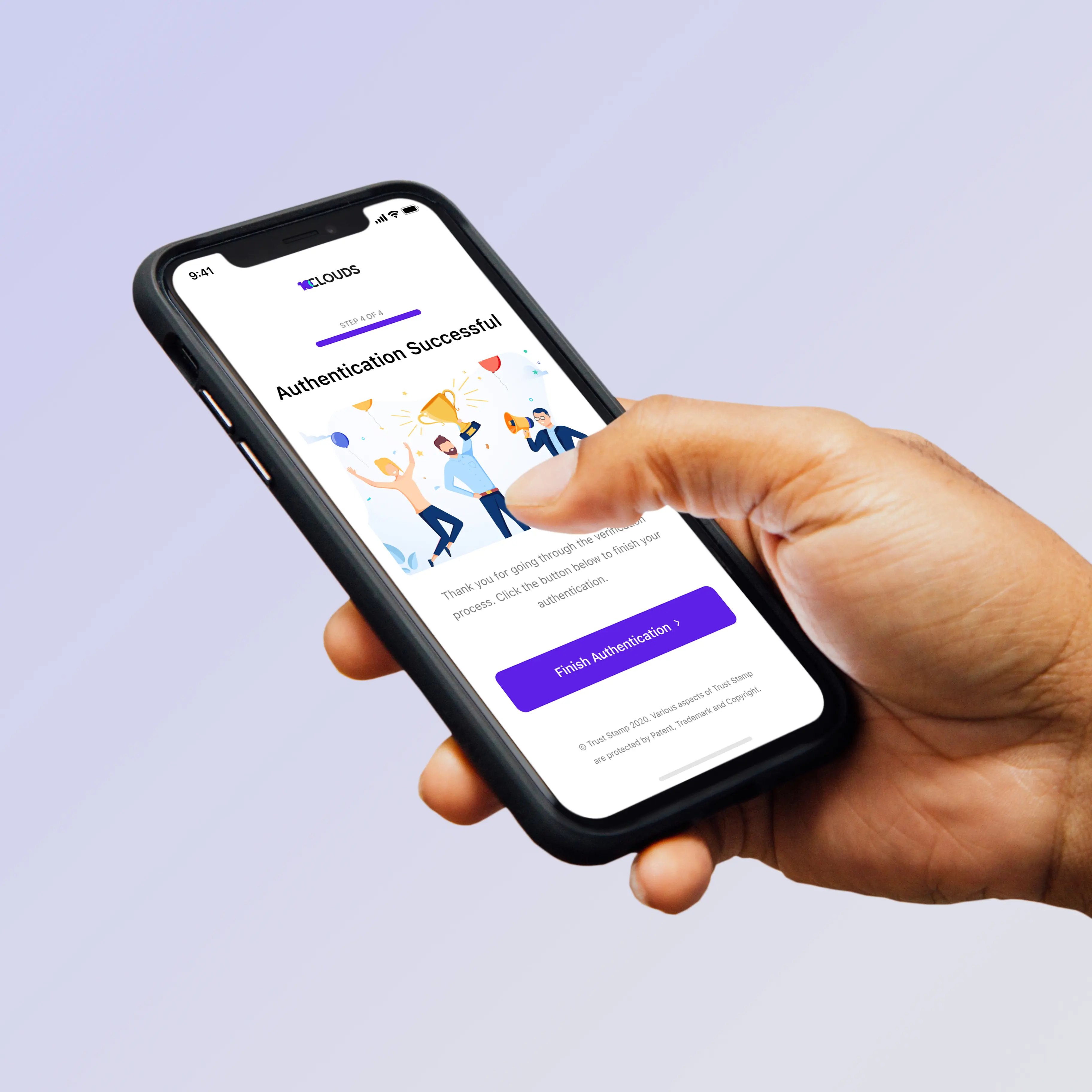
As part of 10Clouds ongoing partnership with TrustStamp, a provider of trusted identity systems, we have worked on a user-friendly, efficient and secure customer verification process. The onboarding process is entirely white-labelled and is built around the following three steps:
- Proof of Liveness: This technology is based on machine learning and uses a facial embedding process to create a biometric hash, which is unique to each user’s profile. It just requires one photo as a point of comparison to determine whether a user is a real person or not.
- Step-up-authentication: This provides the answer to the issue of money-laundering and identity theft. Using the biometric hash, the system is able to confirm the user’s identity, detect potential fraud and only offer access to legitimate customers.
- Compliance solutions: The overall goal is to document and audit compliance requirements by using biometrics while at the same time maintaining a frictionless user experience.
We continue to work with Trust Stamp to put its technology to new uses.
__________________________________________________________________________________
3. Throw out jargon
A smooth user experience comes not just through a clear journey, but also from understandable, jargon-free language. Here it’s always helpful to build user personas, and really analyse your target audience, drilling down not just into their demographics, but also their behaviours and motivations.
Conduct as much qualitative and quantitative research into your target audience as possible before you start to develop, or redevelop your product. The questions you ask will of course depend on the nature of your product, but make sure that they’re open-ended and not leading.
Much as it's tempting to adapt your existing product to suit user preferences, you’ll benefit much more from an open-ended discussion which may take you back to the drawing board design-wise.
Unless your product is geared towards users with extensive financial expertise, your best bet is to go for simple and friendly language.
Example:
Instead of: ‘Fill in your details to complete the KYC check’
Go for: ‘Help us confirm your identity with a few details.’
UX audits
Consider a UX audit if nobody in your team has that expertise. A UX audit is the process of pinpointing areas of improvement of your existing digital product that will reveal which parts of the site are causing issues for users or blocking them from achieving goals.
Simply put, the UX audit will help uncover what is working, what is not, why it’s not working, and how to improve it. Below are the steps for conducting an effective UX audit:
1. Using user behaviour metrics
All behavioural metrics are important in giving you an in-depth insight into user journeys through the site, points of friction, cart abandonment and other important statistics. Here it's important to focus on a longitudinal analysis, rather than a snapshot in time, as this will enable you to spot trends. Useful tools to use include SemRush, HotJar, SimilarWeb and Kissmetrics.
2. Using attitudinal metrics
As a second step, it's very important to use qualitative data from real users of your website, and the simplest way to do this is through usability tests. Running these tests will help you to determine whether any hypotheses that you've made - e.g. 'Users fail to complete the obnboarding process because it is too long' - can be backed up by data.
3. Using user personas
During the UX audit, it's useful to go back to the user personas that you've created for your product and run them against any demographic data that you have on your actual users. That way, you'll be able to sense-check whether any potential issues with your product could be to do with a mismatch between the two.
4. Conducting a competitor analysis
It's important to look at direct and indirect competitors, tracking their user journeys and their overall product usability. A competitive analysis enables you to get a better picture of user expectations and to be able to match them with your own product.
5. Organise your data and draw conclusions
Having gathered your data, it's now time to spot trends and draw conclusions. Use a cloud-based data programme, which allows all your stakeholders to access the data in one place. You might benefit from doing a screen-by-screen analysis of your product to map the complete user flow.
6. Come up with informed suggestions for improvements
Your suggested improvements should cover all areas of the user experience, from visual design through to motion animation, process length, buttons, text and calls to action.
Don't forget about responsive design, which is particularly important when it comes to retaining users. Make sure that the product works well on all devices and that there's nothing that is causing the site or app to slow down. Slow website speed contributes hugely to site abandonment.
When it comes to website copy, clarity and consistency are both king, and you might consider hiring a UX writer to ensure that all your text is as good as it can be (more on this below).
And if you'd like to find out more about UX audits, it's often useful to look at a real life example.
UX writers
UX writing is a relatively new discipline which involves looking after all the copy on a website or app. Content is critical for converting sales, establishing a consistent voice for the brand and generally driving the user experience. An experienced UX writer can help you do exactly that, which is why it’s worth asking your software provider whether they employ someone with these skills.
Many companies have recently realised the benefit of having UX writers, and have hired them into their product teams. According to CareerFoundry (2020), Booking.com have gone from a team of 20 UX writers to more than 60 in the space of just a year.
__________________________________________________________________________________
UniBank - clean and engaging user interfaces
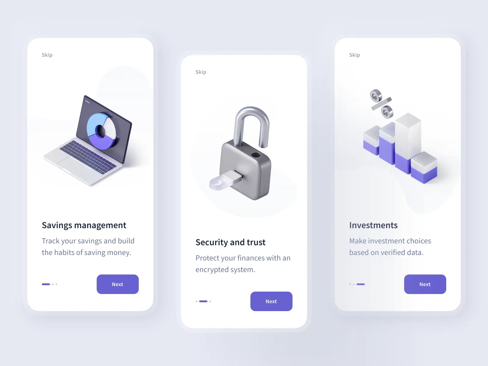
10Clouds created the UniBank project showcase (an internal project) as an example of a clean, appealing user interfaces combined with simple, direct copy and effective calls to action. The idea was to put all of our learning and experience of working with FinTech and banking clients to use in a single product. We paid particular attention to the client onboarding process, which had to provide the perfect balance between security and efficiency.
__________________________________________________________________________________
4. Pay attention to device adaptation
There is one distinctive feature in FinTech products which needs to be taken into consideration when thinking about how the product displays on tablet and mobile devices, as well as on a laptop or desktop screen - these are graphs and statistics. That’s why you should always make sure that your graphics are scalable and readable. Sense-check there isn’t too much data within them to display adequately in smaller dimensions.
You should research the devices that are most commonly used by your target audience which will enable you to define the screen-size that you want to optimize your product for.
5. Introduce features one by one
One of the worst things to do when it comes to building a brand new FinTech or banking product, is to overwhelm your users with choice. Keep your main product suite to a minimum, and limit the amount of options that your customer is faced with at every stage.
If you’re looking to introduce a new feature or to upsell a new product to your existing customer base, make sure that you do this when you’ve given them sufficient time to engage with your primary offer.
6. Consider haptics
Haptics is the collective term for technology that can create an experience of touch by applying forces, movement and vibrations to the user. According to a recent research report, published by MarketsandMarkets, the global haptic technology market size is expected to grow from USD 2.6 billion in 2021 to USD 4.6 billion by 2026. In FinTech and banking, an increasing number of app providers are incorporating haptics into their future client offering.
One of the most recent offers is from UK-based company Ultrahaptics, which is developing an ATM interface of the future, where a user can feel buttons in mid-air. There is a security benefit: the keyboard projection can only be seen when you stand directly in front of it, making it hard for anyone to spy personal details. This investment in haptics drives progress throughout the value chain and means that if you pay more attention to this emerging area now, you’re likely to be head and shoulders above the competition.
__________________________________________________________________________________
10Clouds and Emergent - ongoing UX support
Emergent is a FinTech company working on creating a gold-backed stable coin and a verified supply chain for trusted gold. 10Clouds designed and implemented the User Experience for the registration process overhaul, which involved extensive testing and research into the user demographics.

__________________________________________________________________________________
Ignore UX and UI at your peril
The above examples should give you a strong insight into the important role that good UX and UI play in the success of FinTech and banking products. That’s why it’s good to pay attention to this FinTech UX design from the very outset. A fantastic user experience will stand you head and shoulders above the competition.


