
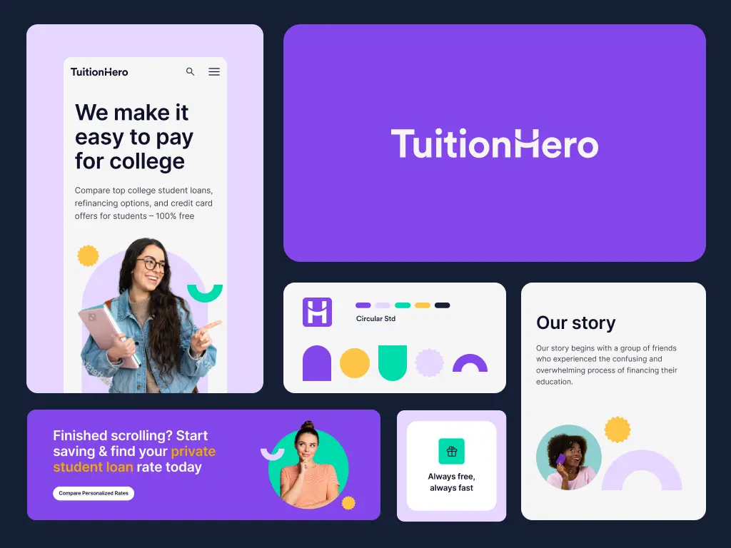
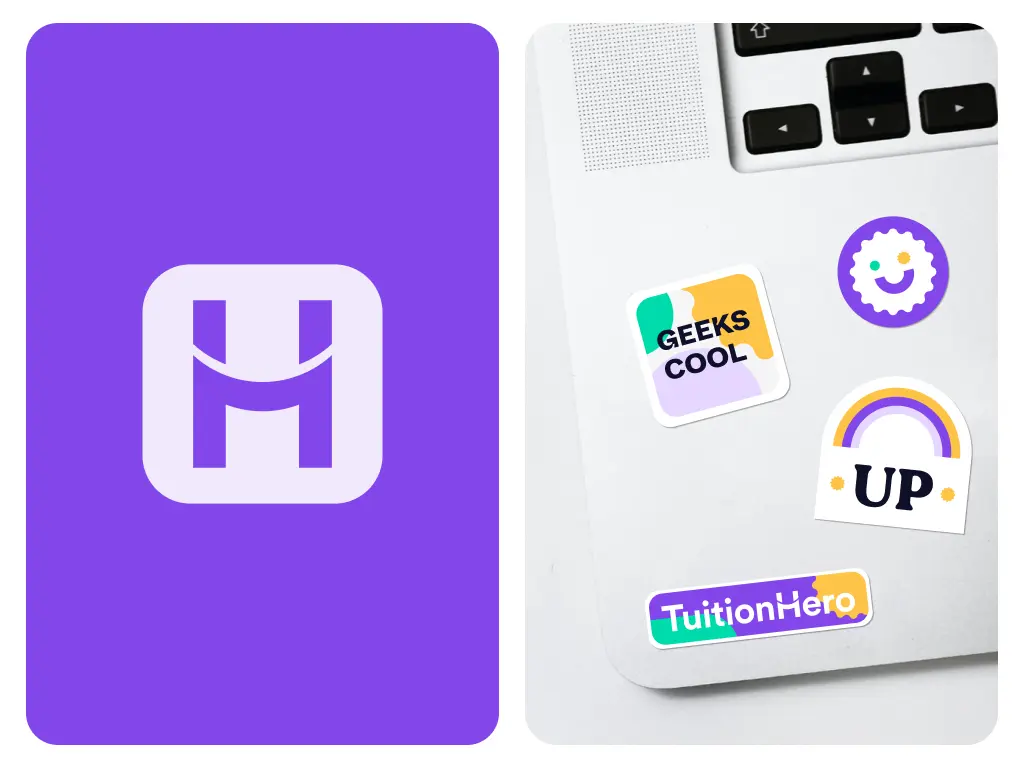
The solution began with the creation of a new branding concept that would encapsulate the essence of TuitionHero. The new logo was meticulously crafted, incorporating geometric typefaces that mirrored the brand's vision. The letter 'H' in the logo was designed to represent a bridge, symbolizing the connection between students and universities, a hug indicating support from TuitionHero, and a smile reflecting the positive impact on students' financial reality.

TuitionHero: Rebranding a Marketplace for Student Loans
Website
Timeline
August 2022 - Ongoing
Type
Branding, Design System, UI Improvements, Icon Library
Country
United States
Industry
Education
TuitionHero emerges as a pioneering online marketplace dedicated to simplifying the search for student financial aid. By offering a platform where students can quickly compare and select from a variety of student loans and refinancing options, TuitionHero stands out as a friendly guide in the complex world of student finance.
Services
Branding
UX/UI
Visual Language
Project in numbers
3
Discovery sessions
11
groups of needs
23
competitors analyzed
Introduction and Goals
TuitionHero's mission is to be the ultimate resource for students navigating the complexities of student financing. With many years of industry experience and firsthand frustration with existing platforms, our client set out to provide a comprehensive, user-friendly solution.
To achieve this, our primary objective was to craft a compelling brand identity that would resonate with both students and the financial sector. This involved developing a robust design system and component library to ensure a cohesive, user-friendly and engaging experience.
The significant challenge we met was creating a brand that would appeal to the youthful and diverse audience of students while maintaining the professionalism required in the financial industry. For that, we had to blend all the UX design elements seamlessly.
Solution
After identifying the core challenge, the 10Clouds Design Team held a product discovery process to redefine TuitionHero's brand and user interface, ensuring it resonated with its target audience while maintaining the integrity and professionalism financial institutions require.
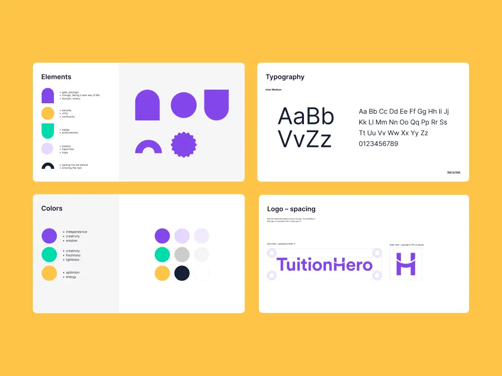
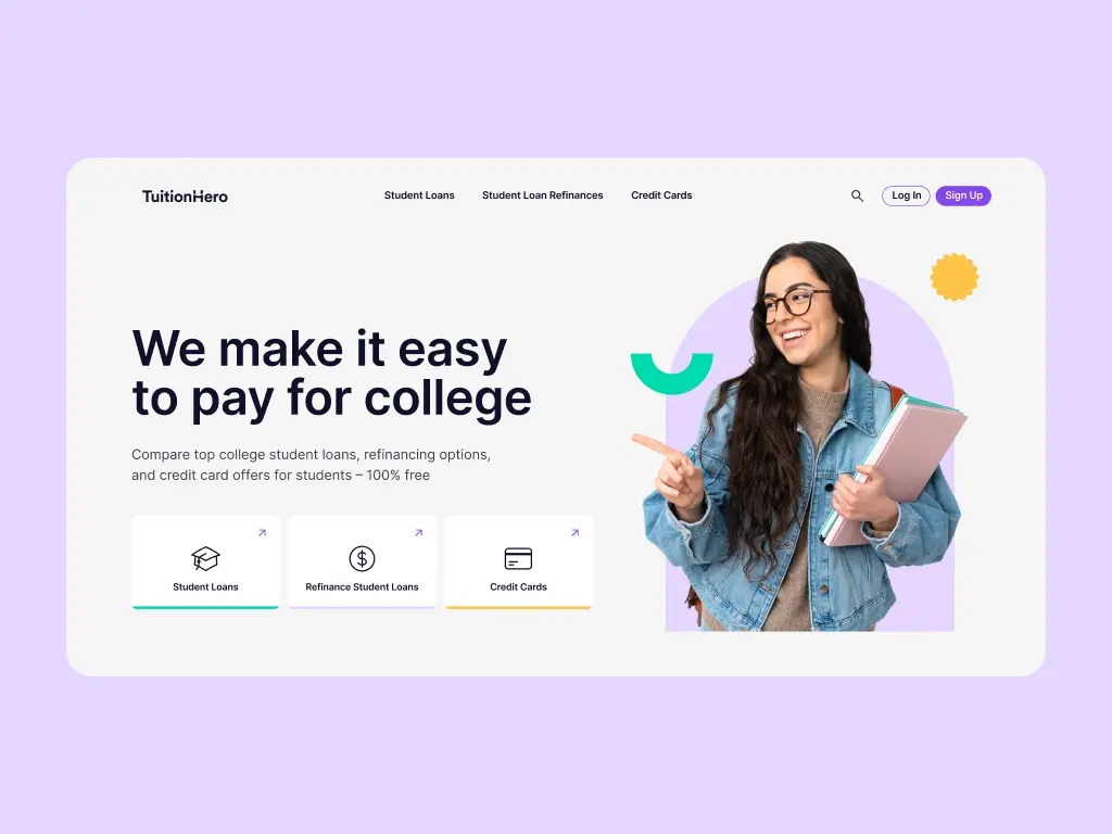
To inject vibrancy and energy into the brand, we chose a color palette featuring vibrant purple, green, and orange. These colors were selected for their ability to convey friendliness and dynamism, essential qualities for engaging with the student demographic. The use of solid colors and geometric typography in headlines further established a professional yet approachable look, crucial for the financial sector.
The development of a comprehensive design system was pivotal in addressing the project's challenges. This system included a library of components that facilitated efficient project management across various websites, ensuring consistency and coherence in the user experience.
Key UI improvements were implemented, starting with a UI audit to identify elements that required enhancement. Inspirational websites were benchmarked, and numerous design solutions were tested on the homepage in different contexts. This rigorous process led to the selection of the most effective design concepts.
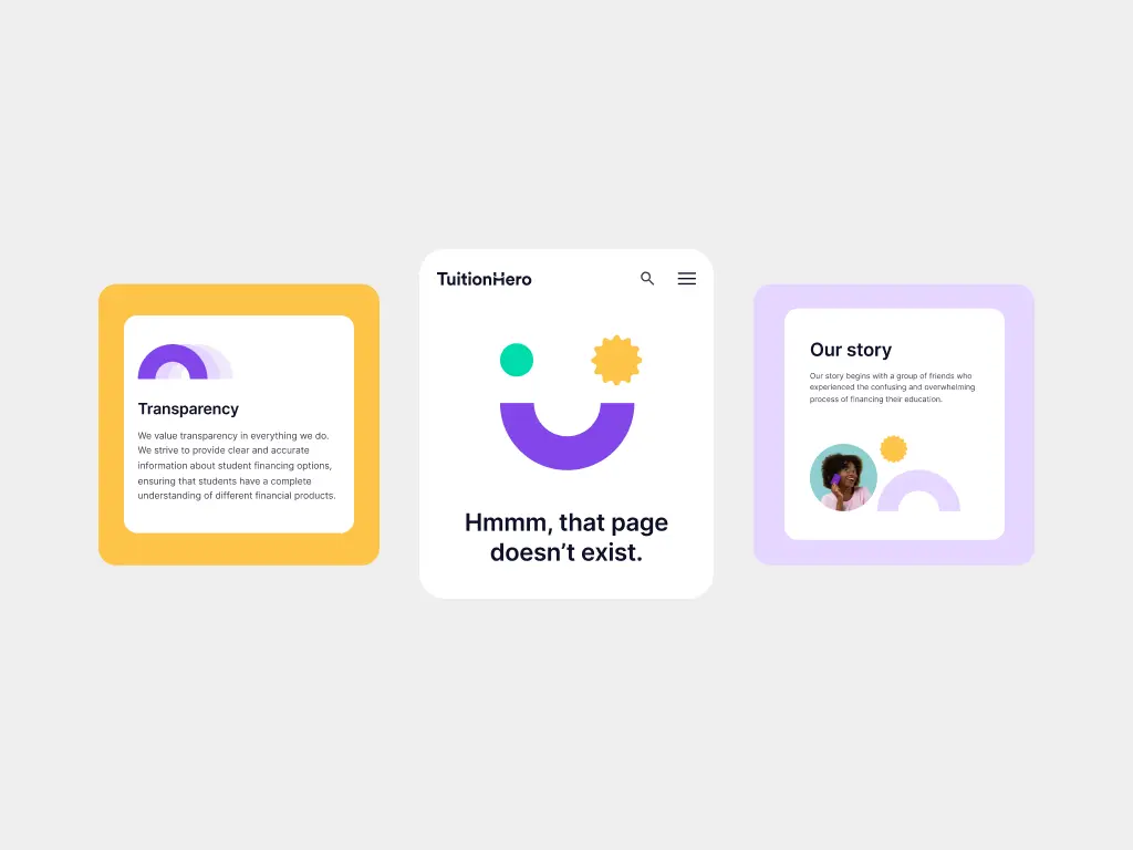
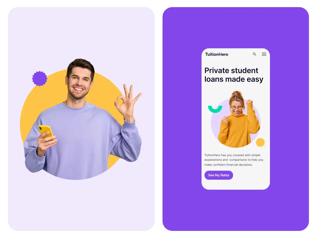
Significant changes included the replacement of the font in hero text and headlines with something unique and memorable, aligning with the brand identity. The primary and secondary colors were also refined to evoke the desired emotions without compromising accessibility. Maximizing white space became a priority to improve content organization and legibility, especially in text-heavy sections.
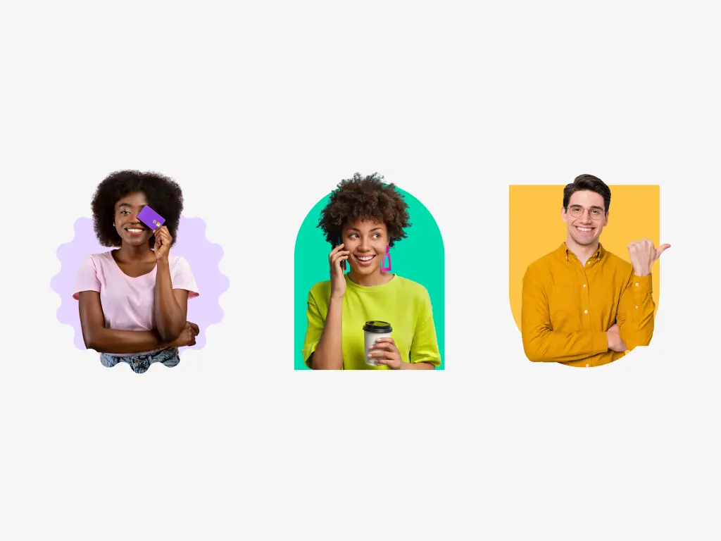
The icon library was updated with Heroicons, chosen for their ability to convey a friendly and energetic vibe, crucial for standing out in the digital landscape. Additionally, the decision to remove gradient blobs from the design was made to ensure every element of the branding was meaningful and contributed to the narrative of empowering students.
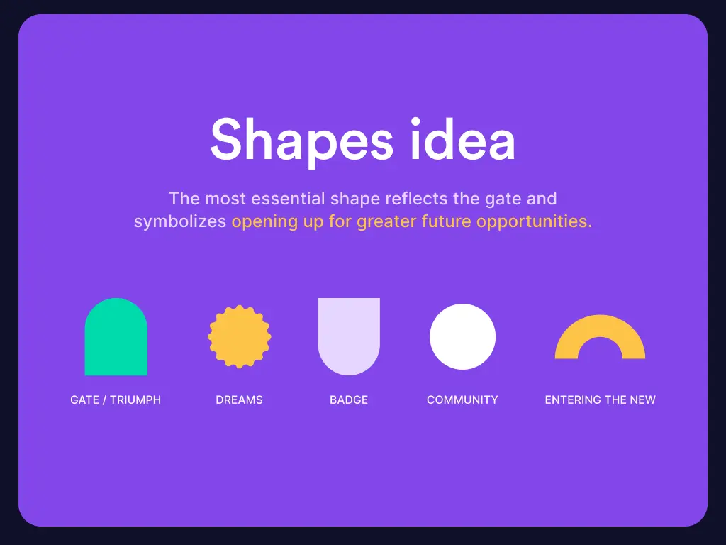
Central to the solution was the concept of opportunity, represented through five geometric shapes, each with its own significance. The gate shape, symbolizing the opening up to future opportunities, was the cornerstone of this concept. This approach not only provided a visual representation of TuitionHero's mission but also reinforced the brand's commitment to helping students achieve their dreams.
Through these strategic branding and design initiatives, TuitionHero successfully addressed the challenges it faced. The result was a visually appealing and functional marketplace that resonated with students seeking financial aid, effectively balancing the youthful and professional aspects of the brand.


Deliverables
Deliverables
01
Branding Concept
A unique logo and a vibrant color palette that embodies the bridge between students and universities, support, and optimism.
02
Design System
A comprehensive design system featuring geometric typography, saturated colors, and increased white space for better legibility and user engagement.
03
UI Improvements
Enhanced user interface with a focus on accessibility, including a new font for headlines, optimized color usage, and a clean, modern aesthetic.
04
Icon Library
Transition to Heroicons for a more friendly and energetic visual communication.
Business impact
The reimagined TuitionHero brand and website have significantly improved the user experience, making it more accessible and appealing to students seeking financial aid. The strategic branding and design enhancements have not only elevated the platform's usability but have also positioned TuitionHero as a leading resource in the student financial aid marketplace.
Through this transformation, TuitionHero has successfully bridged the gap between students' aspirations and the financial means to achieve them, fostering a community of empowered and informed users.
Check other case studies


WEB3, UX/UI, PYTHON BACKEND, SMART CONTRACTS
Moon Mortgage
From a startup to acquisition, Moon Mortgage is an example of a novelty in the web3 industry. 10Clouds helped discover the idea of this cryptocurrency-backed mortgage credit platform, and develop it into a compelling product with branding like no other.

MIGRATION, TEAM AUGMENTATION, MAINTENANCE
Workforce Management Solution
Managing a distributed team across continents can be tough. But in just months, we turned time zones into an advantage. With our expertise in team augmentation and Python development, we helped our client seamlessly migrate their system—boosting reliability without growing their in-house team.

WEB3, TOKENIZATION, UX/UI
Super Registry
The carbon credit market, vital for global sustainability efforts, has long struggled with reliability issues. Our client envisioned a solution: a super-registry built on blockchain technology, offering a single, trustworthy source of information.

